Case Study
RupaOne
Objective
Overview
The current technological developments ‘force’ us to maximize the use of technology in our daily activities. Even when we wake up, shower, eat, and go to work, technology is quietly tucked into the activities we do. Technology also exists when tertiary activities such as preening. Among these technological advances, there are also concerns about the side effects and other worst-case scenarios. This anxiety is also often felt by women and men who are also users of technology in their preening activities. Anxieties that may sound ‘trivial’ to some people, such as the originality of the make-up or skincare products they use. Until the most complicated about what makeup or skincare products are suitable and not suitable for their skin. These concerns made me decide to make a mobile application “RupaOne”.
Vision
To become the best of health and beauty e-commerce for social life people
Goals
There are some goals when the product was launched:
- Provide the best original product from the e-commerce
- Become one of the apps that brings benefit to people
Initiatives
To achieve the vision above, we need to:
- Build Rupaone App that connects C2C
- Develop Rupaone that can skincare/makeup marketplace that serves original products
- Build a social community that shares their experience in daily life
- Encourage local product skincare to be profitable
Duration
6 Weeks
Project Type
Collaboration Design Exercise
Role
UX Research – UI Designer
Team Member
Marshall Kevin

Azzura Aqmarina

Krisvriziel Londong

Wafi Saputra

Ikhlasul Amal

Abel Wiratama
Aura Dienislami
Nurhikma Amdar
Timeline
Research
At first, we define the main problem by collecting data from defined user and do brainstorm session for the solutions.
Design
We make a sketch based on idea in previous phase, and elevate it into low fidelation screen plus we also verify it flow by conduct an internal testing.
Finaly we’re on visual direction phase which include design system and guidelines and also implement it into the hi fidelation design.
Prototype
We turn static hi fidelation screen into dynamic prototype to make a clearer vision for user in order to test the application and website design.
Usability Testing
We conduct the testing phase to people around me to understand whether the application and website already solves what the users need or not.
Research
User Needs
We realize that UX designers shouldn’t make a design by personal assumptions, that way we find the perfect method to dig deeper into what the user genuinely needs to solve the problem. So we decided to conduct an interview with people selected by surveys who matched the extreme user.
Interview
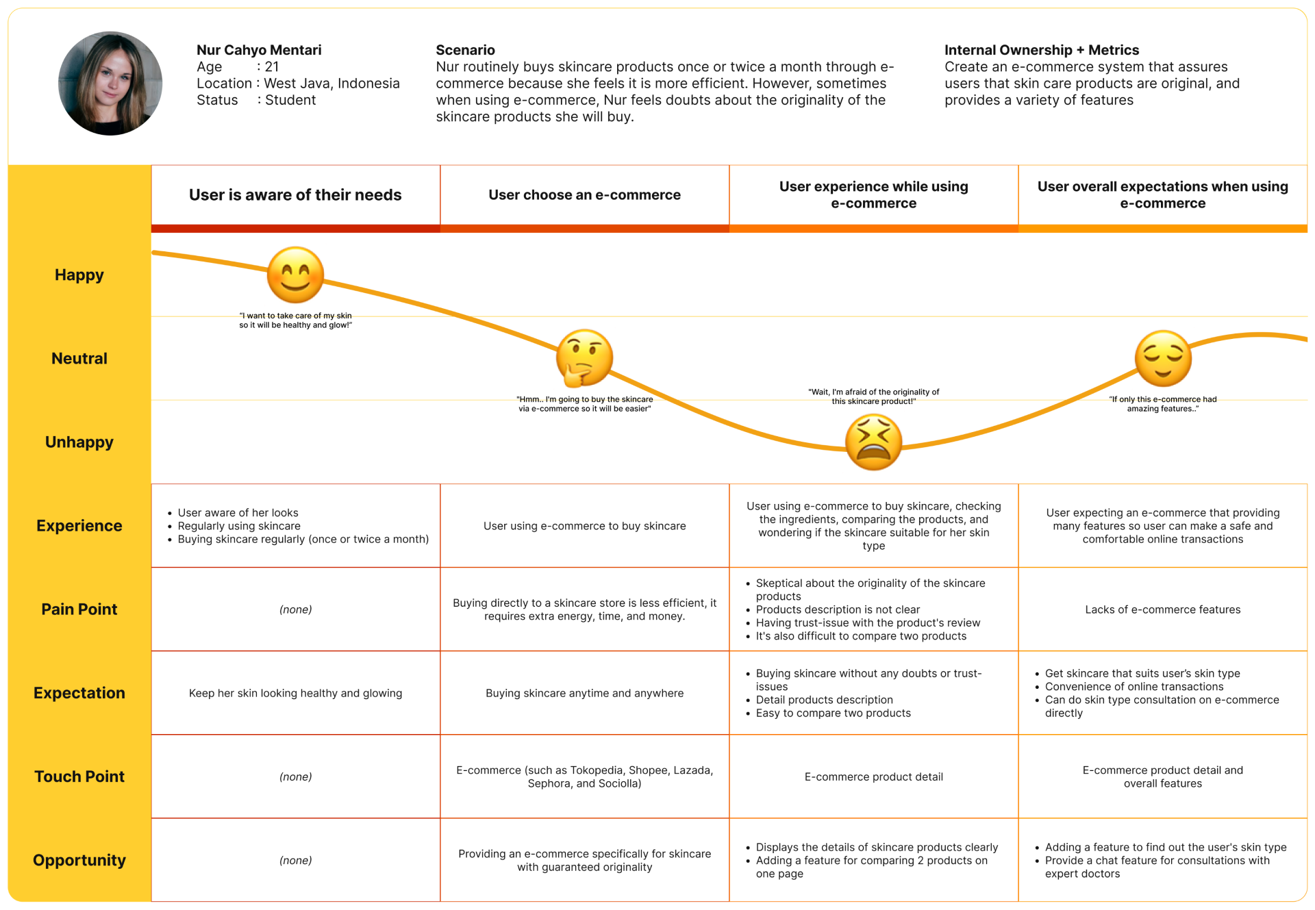
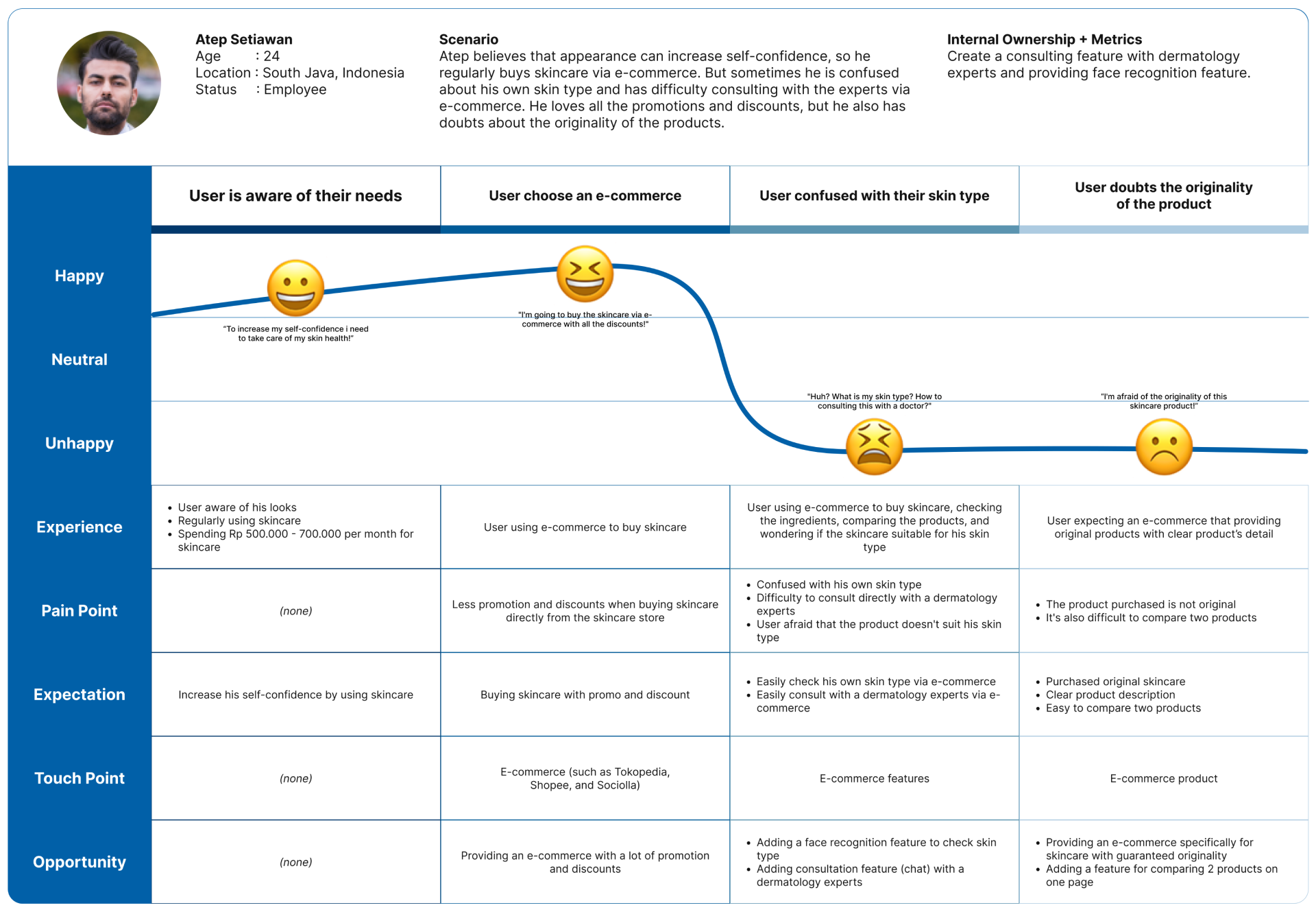
Based on the hypothetical problem, we drafted a couple of questions and casually asked selected people whether they had any pain when shopping for makeup or skincare in the marketplace. Our hypothesis is that users tend to worry about product originality, but on the other hand, users want to get the best deal.
As expected, users barely feel safe because there’s no guarantee the product will be original. However, some users eventually don’t cautious about product originality as long they get the lowest price.
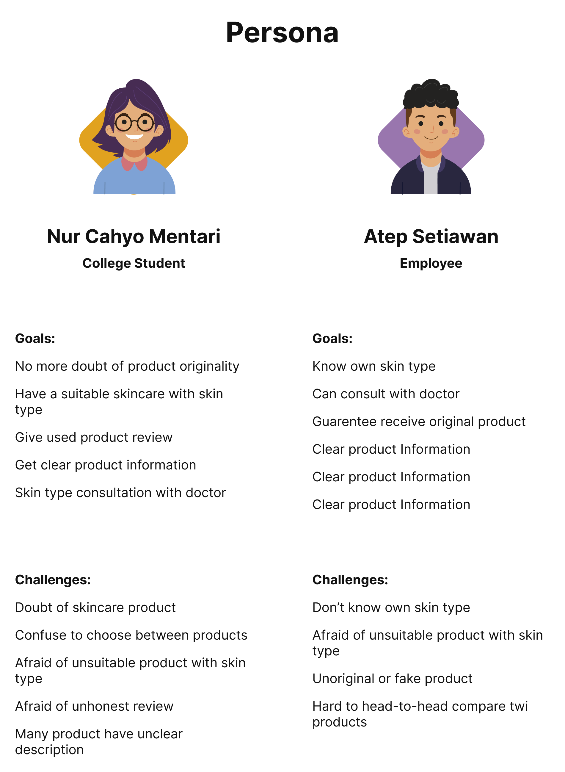
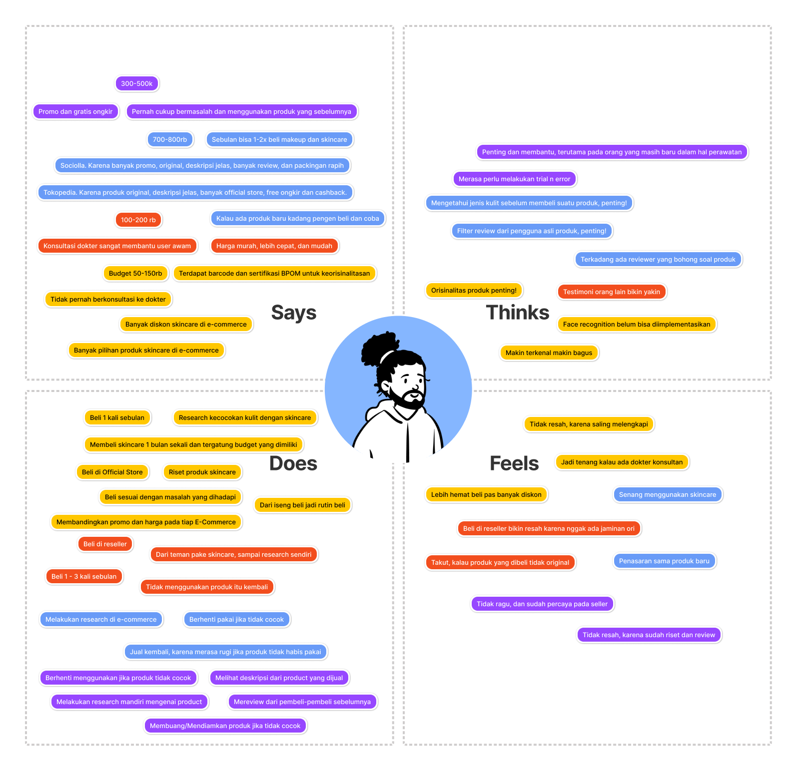
After those interviews, we summarise them into personas to be the guideline of our design process.
User Journey
Empathy Map
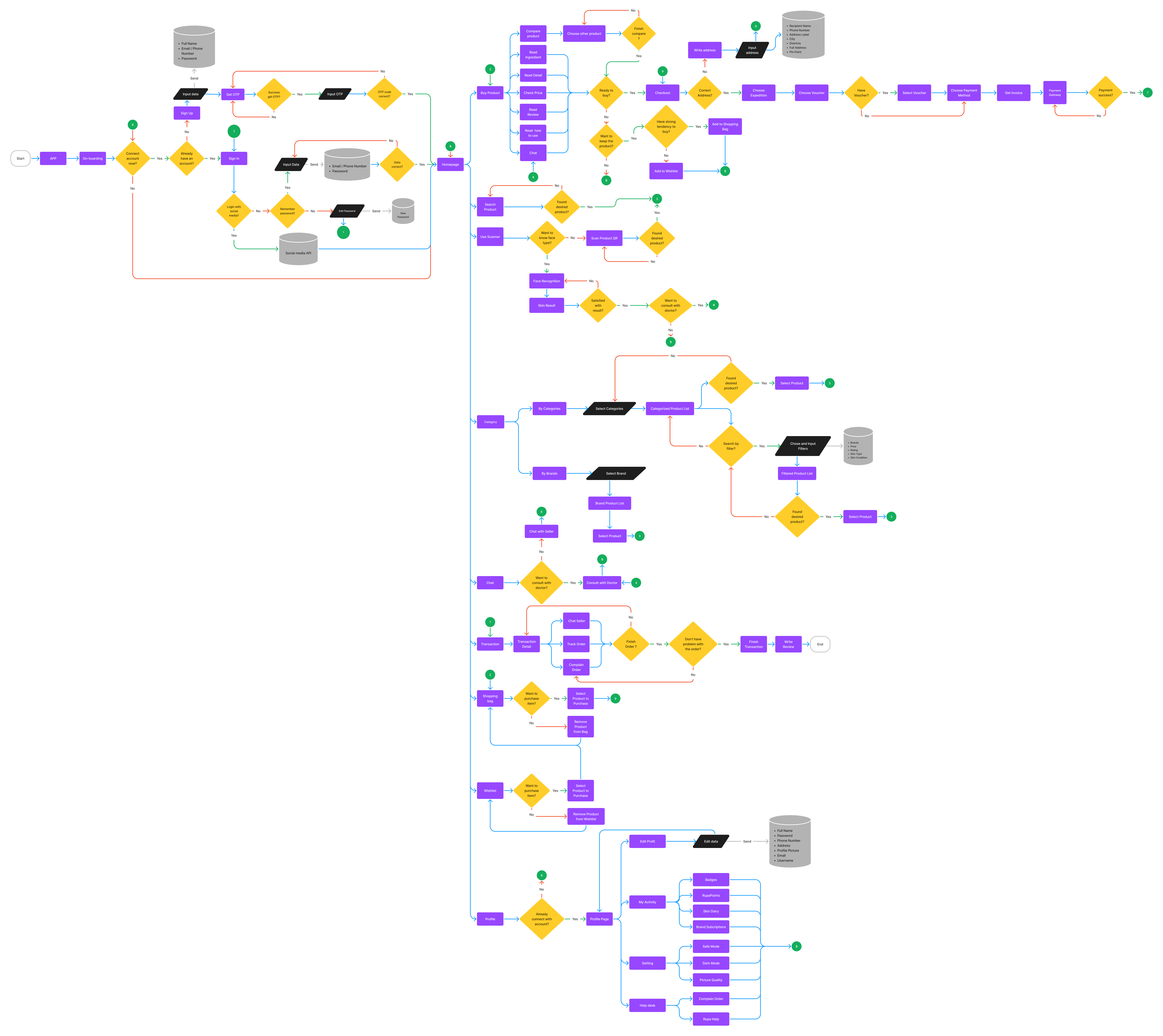
Whole User Flow
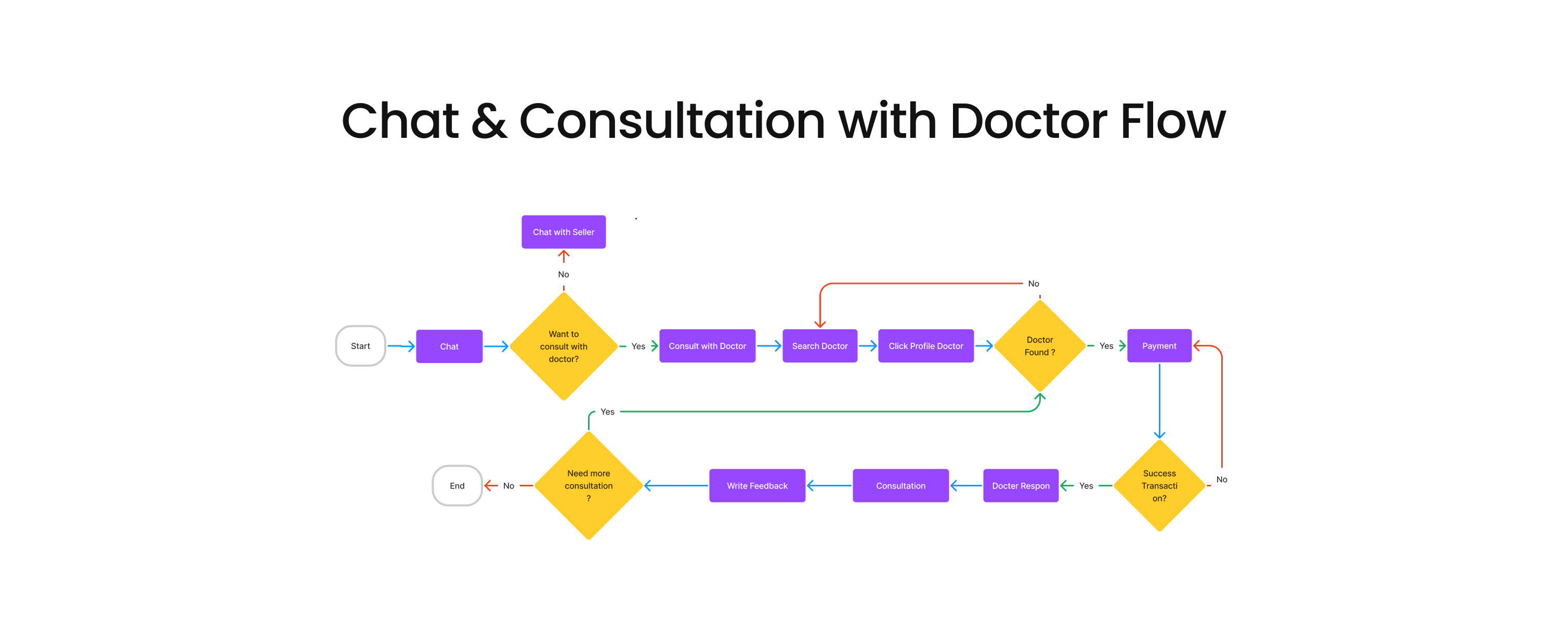
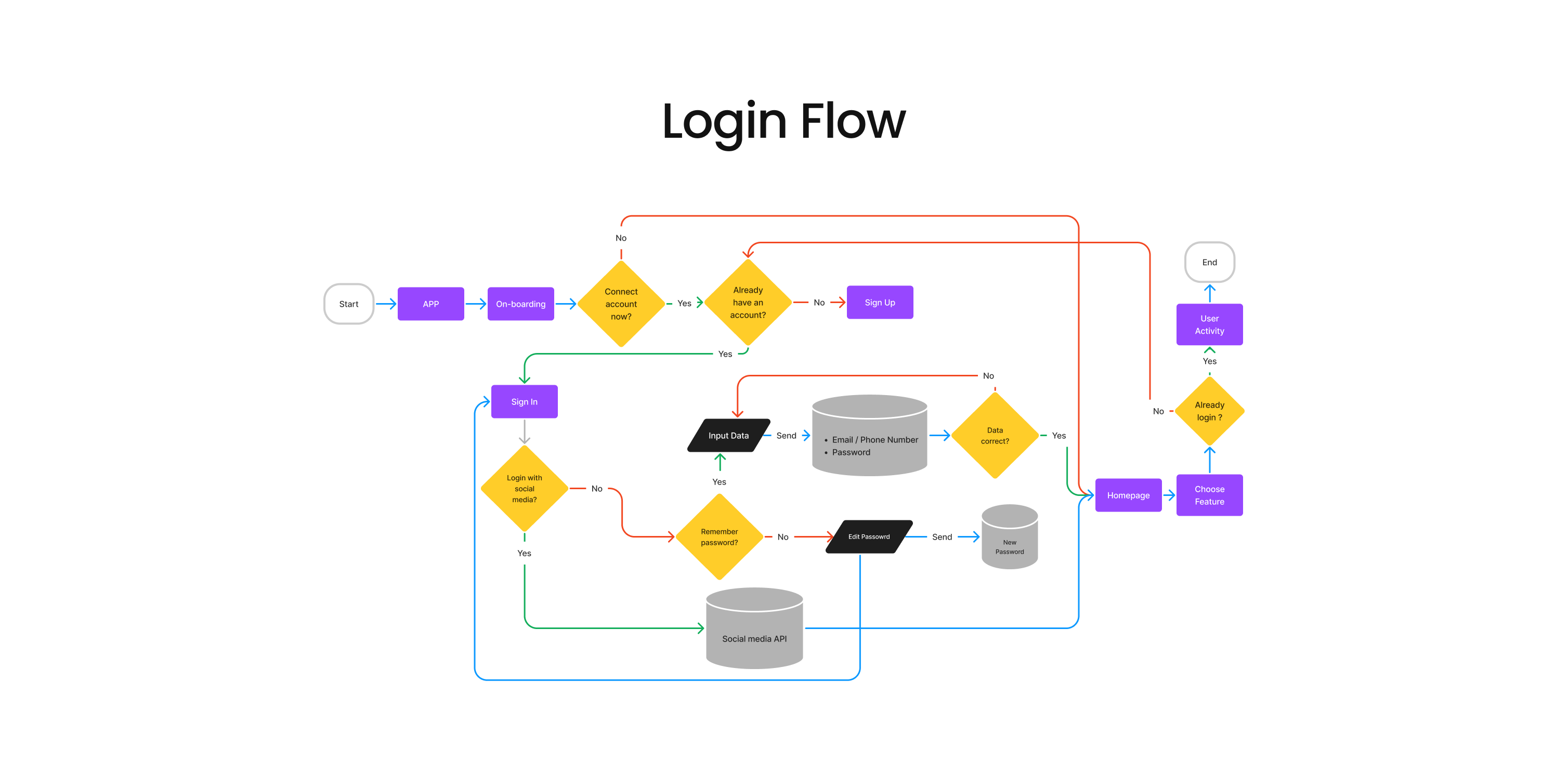
Feature User Flow
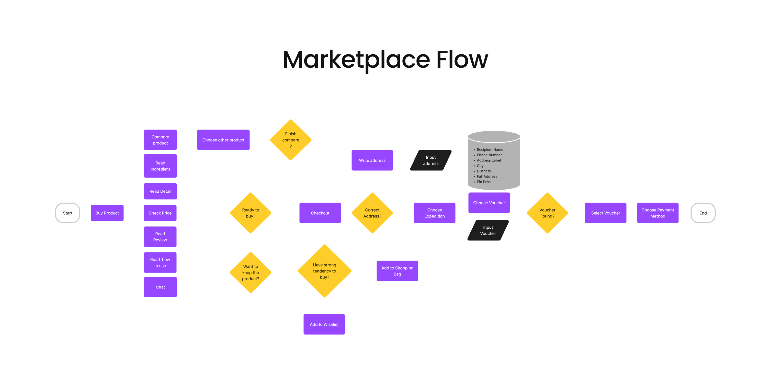
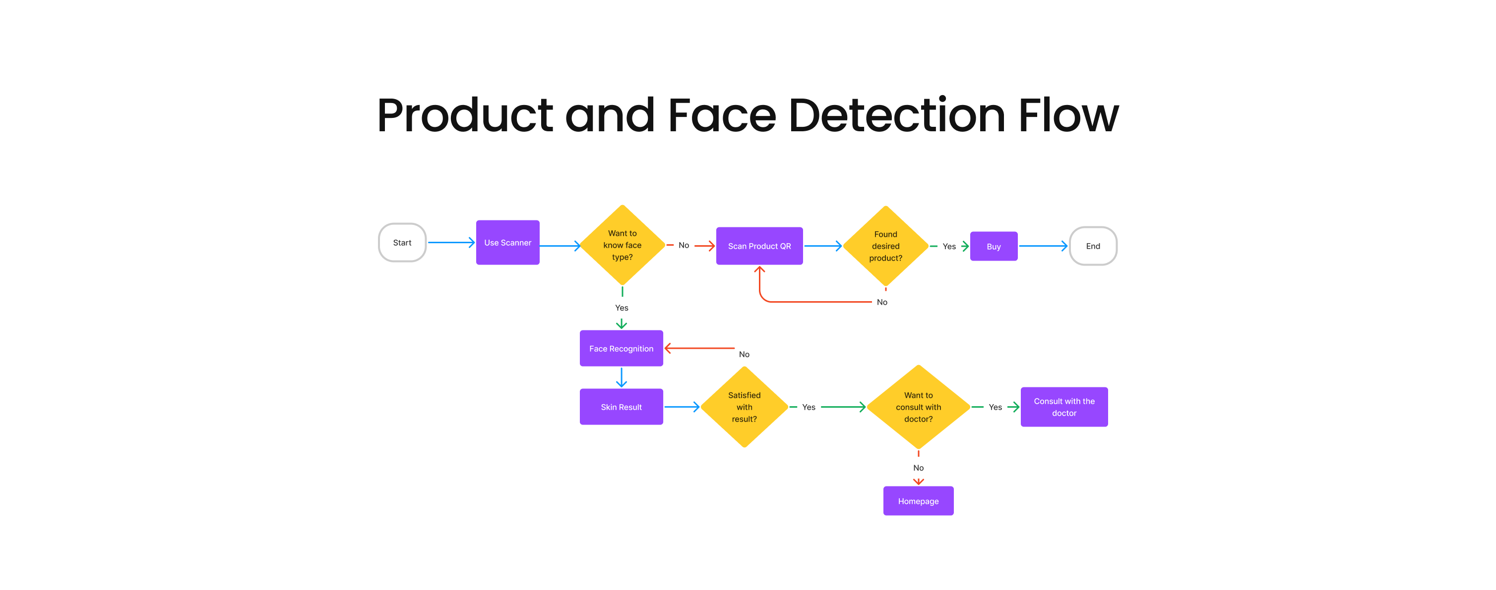

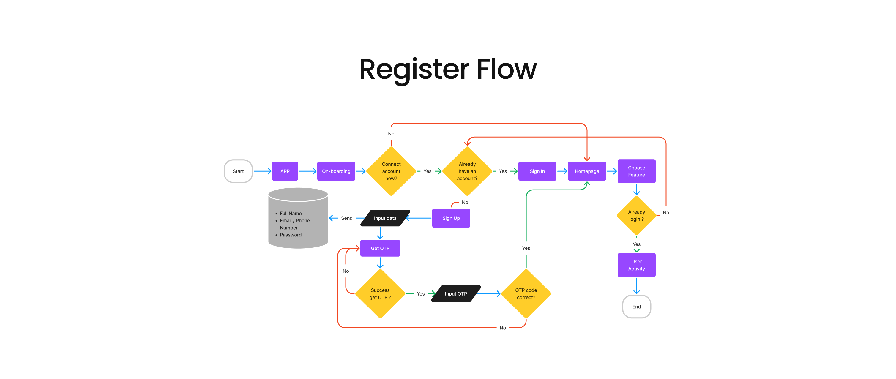

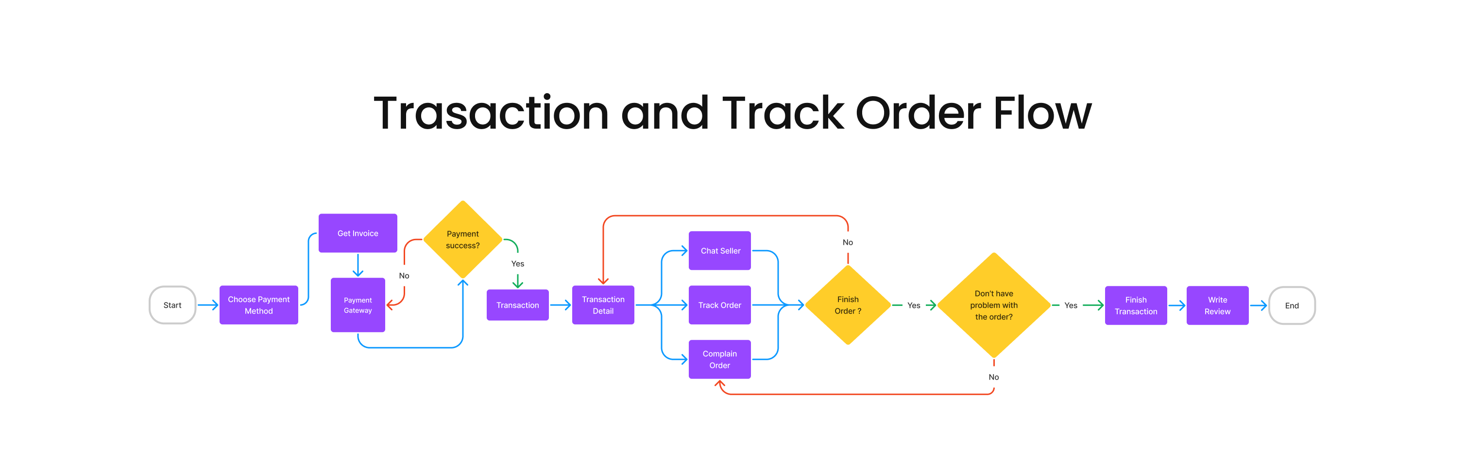
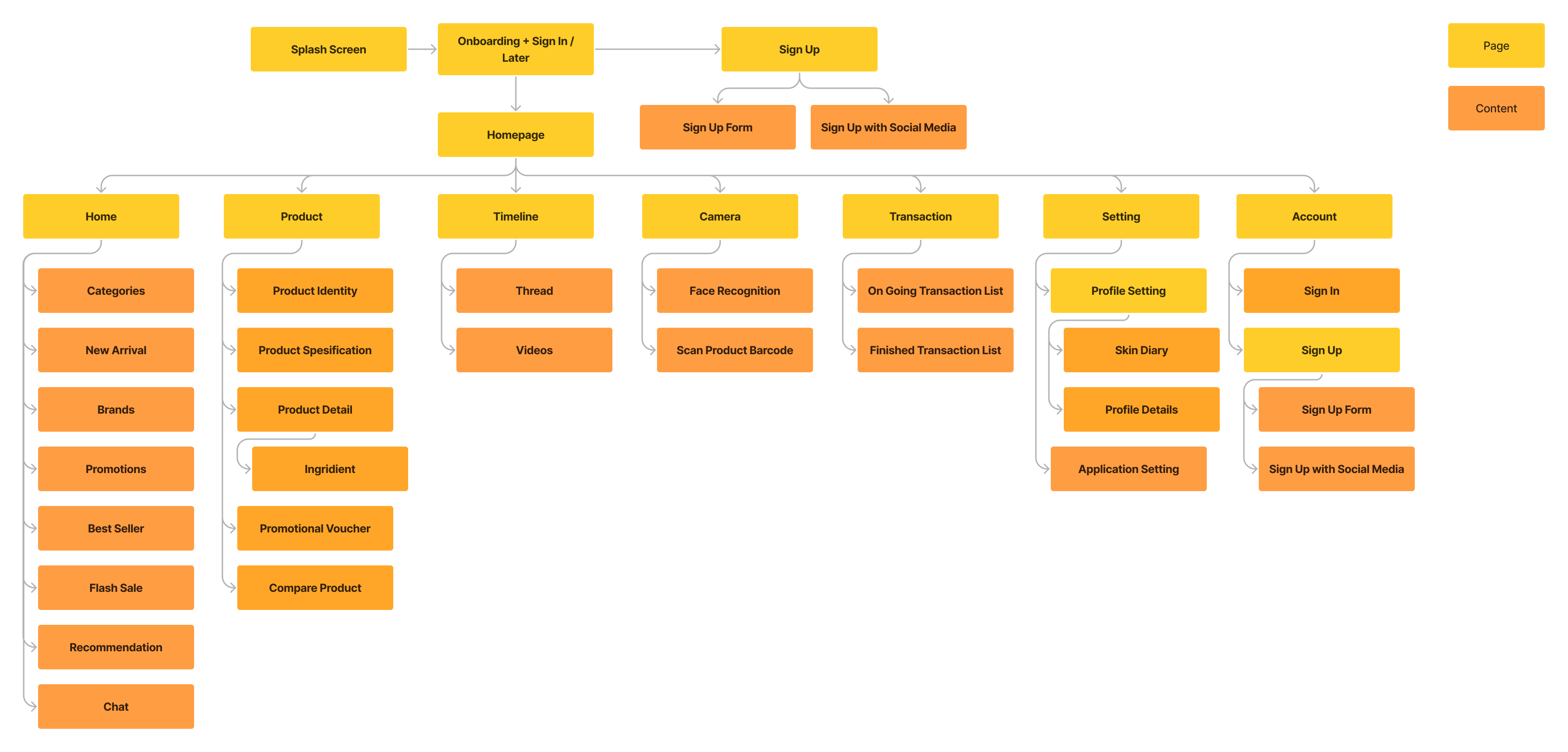
Information Architecture
To minimize user effort when searching for one particular piece of information, we arranged the information architecture to give essential information on the dashboard or homepage.
Design
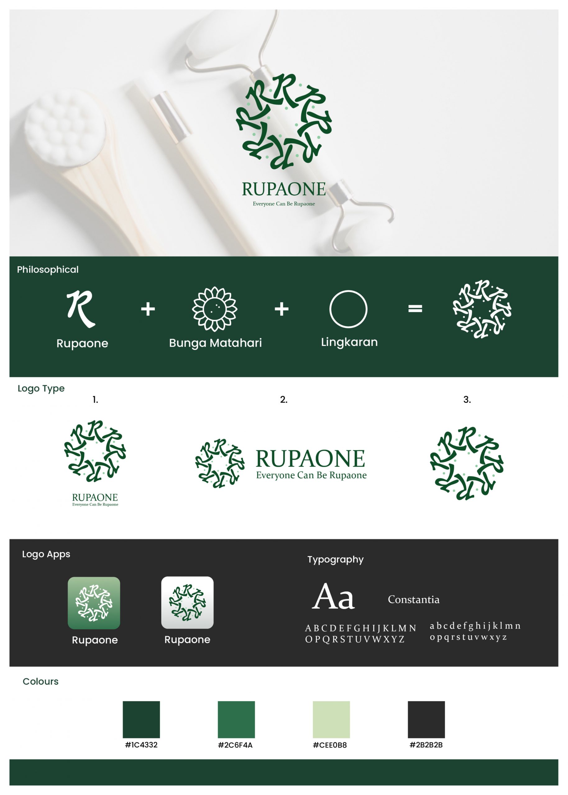
Brand Attributes
People love simplicity, and as we know “less is more” brings me an idea to make users don’t have to spend more time inside the application. So I tried to make the application simple, fast, and of course, fulfill the user’s needs.
UI Style Guidelines

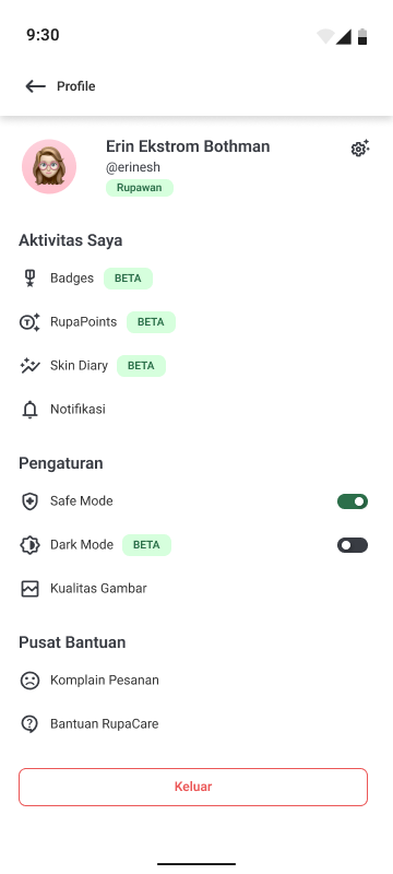
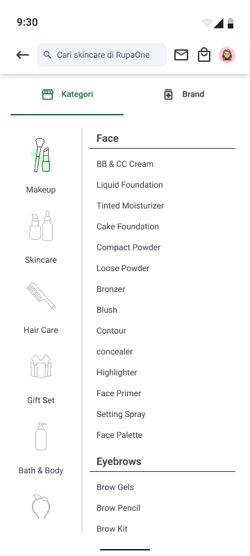
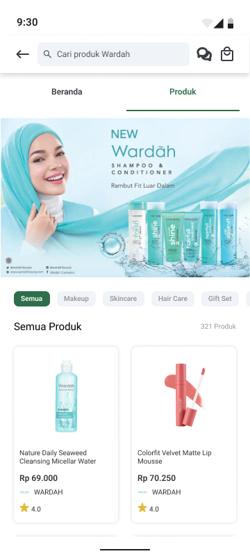
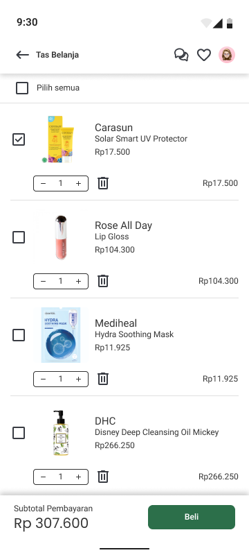
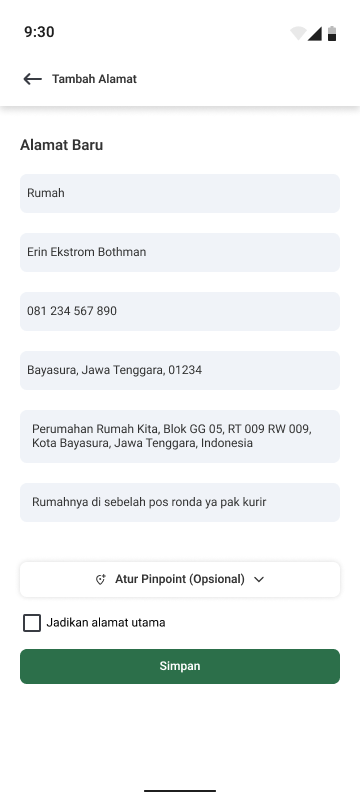
Hi Fidelity Design
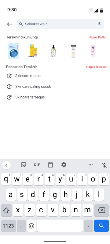
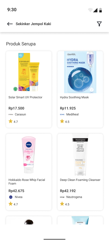
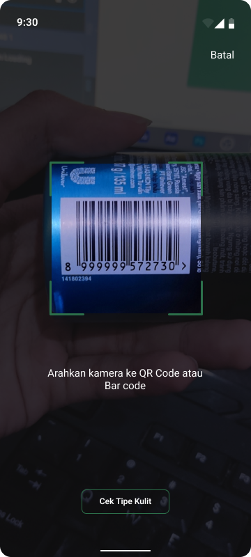
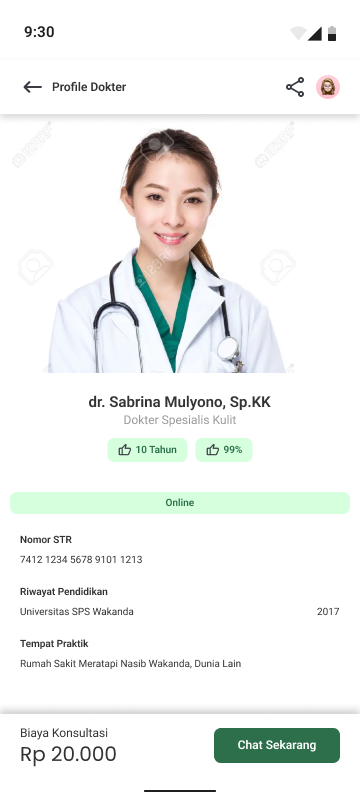
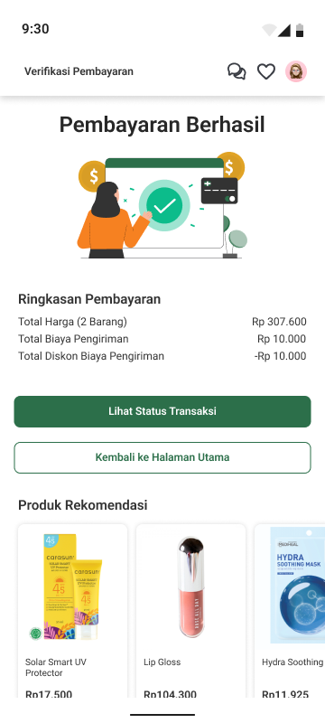
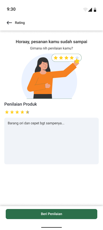
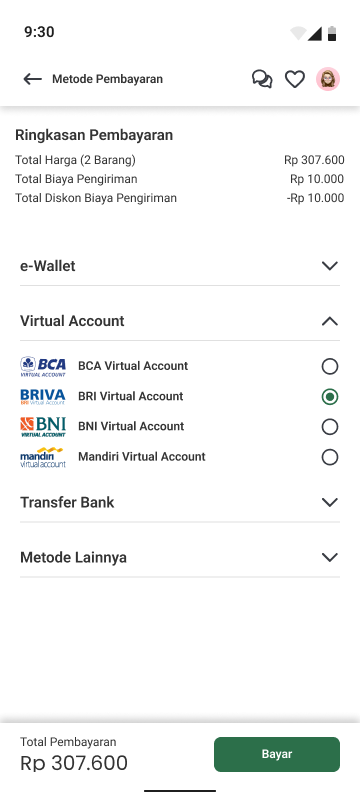
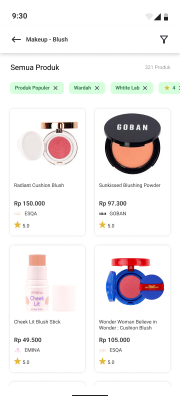
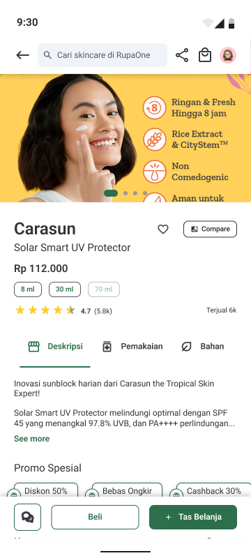
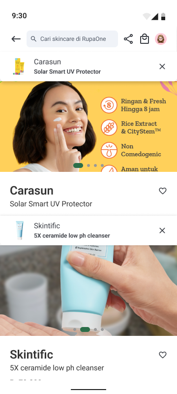
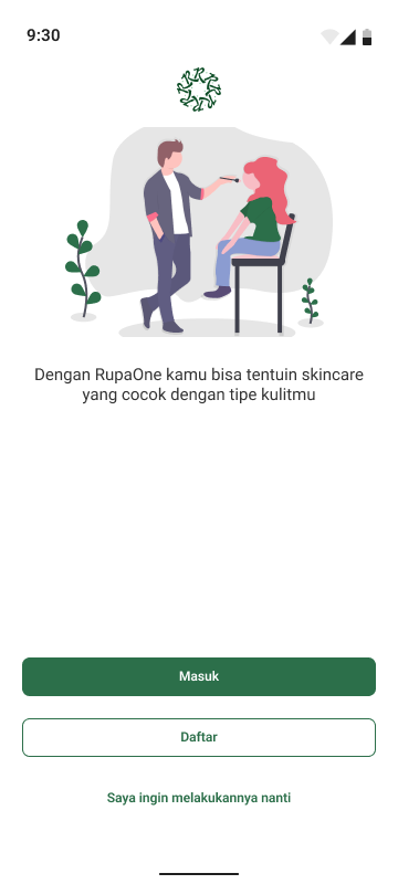
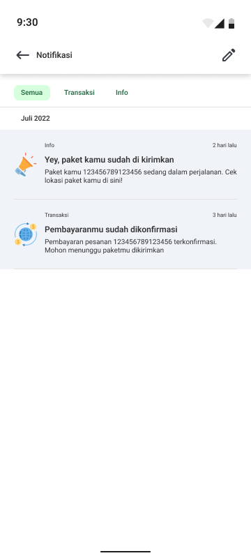
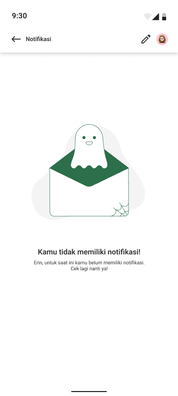
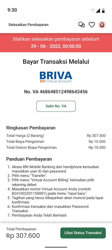
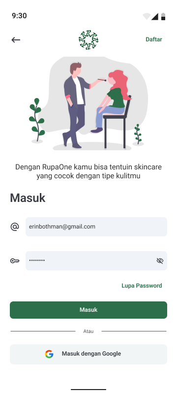
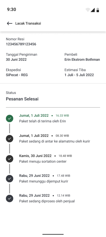
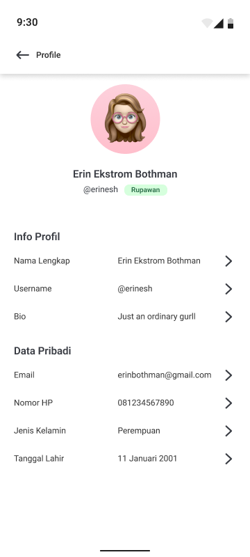
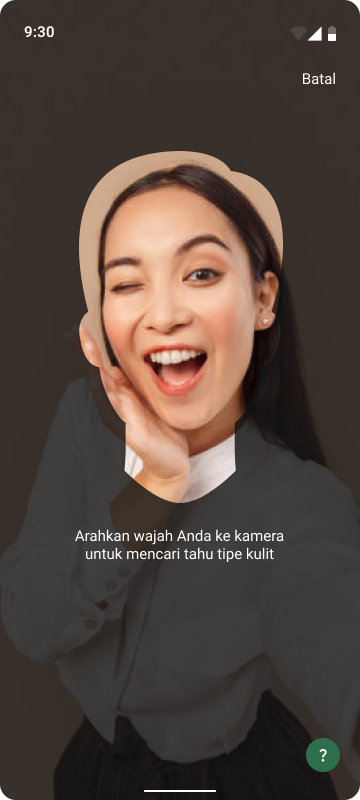
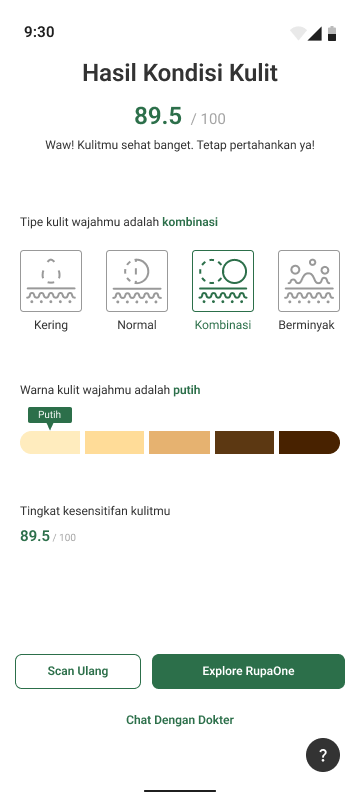
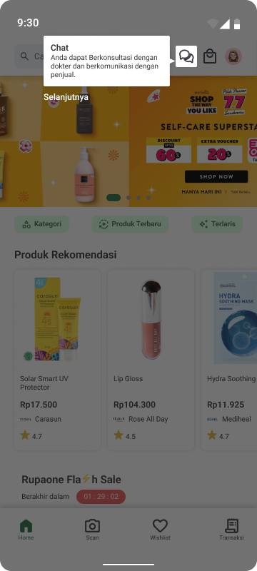
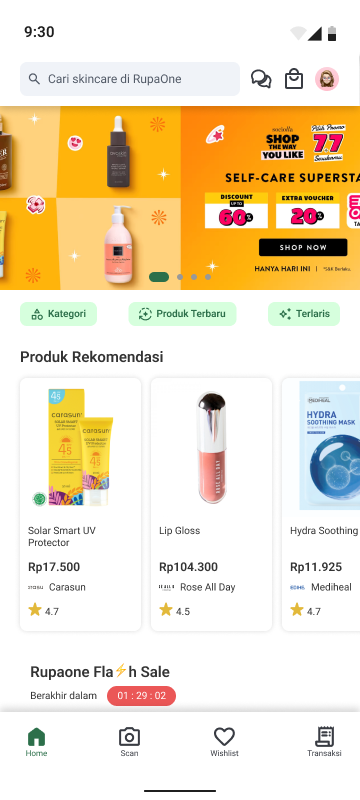
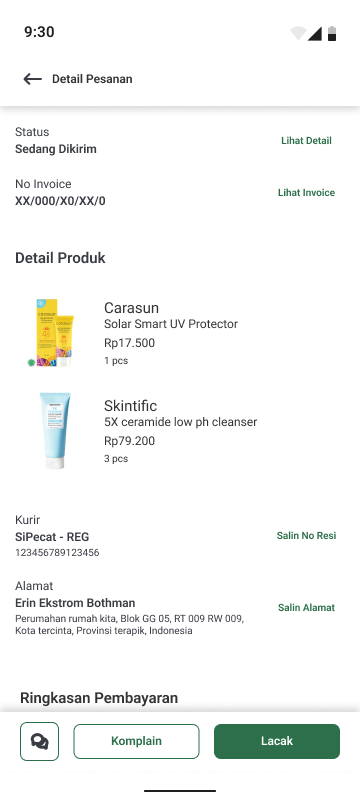
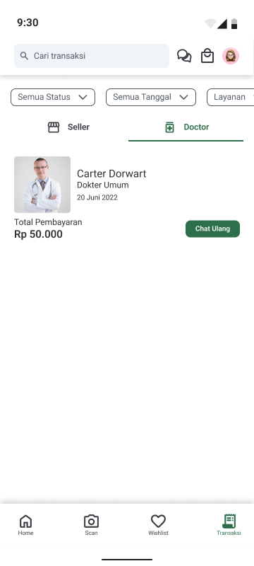
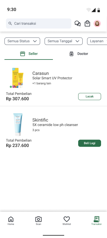
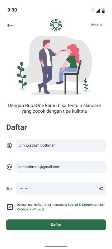
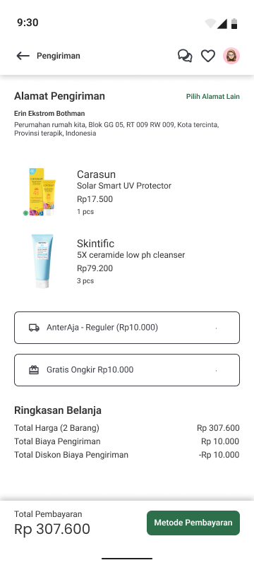
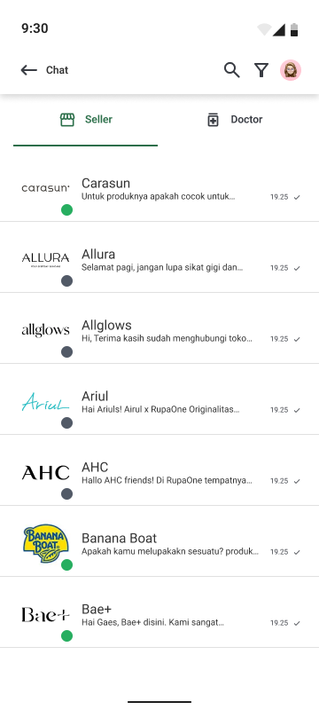
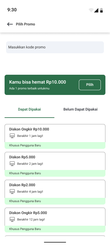
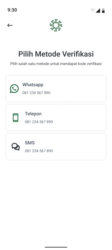
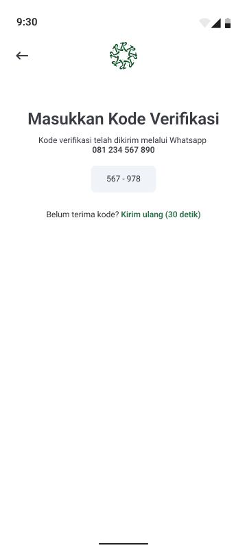
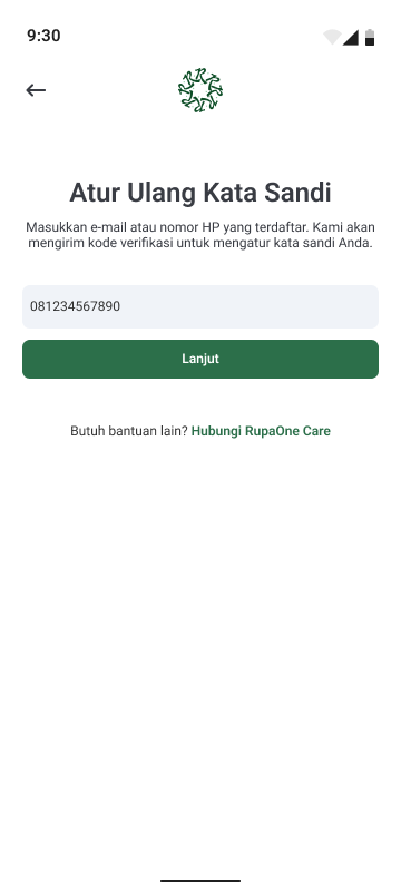
Face Analysis
Wanna know how healthy and what type your skin is?
I designed the application with this feature so newcomers can know what type of their skin exactly. Plus, this feature may be good to check weekly or monthly skin health score.
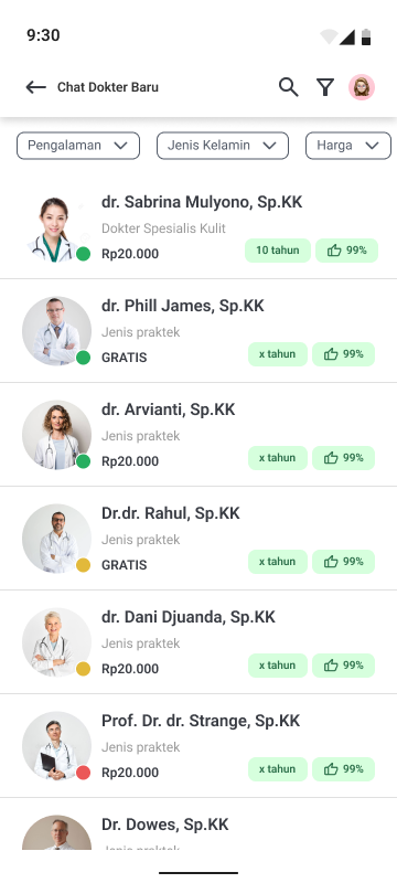
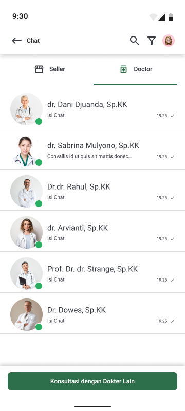
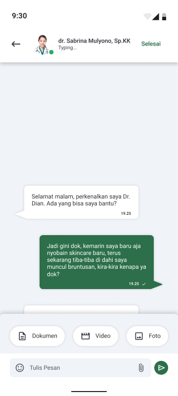
Telemedicine
Consultation with doctor on-the-go
Do you have questions about why this product doesn’t work on your skin? The doctors here are available to answer all your questions.
Compare Product
Have many products to compare side-by-side?
Have you felt tired of changing pages just to compare two products?
RupaOne brings your dream come true, you can compare two products side-by-side hassles and no more changing pages.
Prototype
To accommodate the testing phase, I create the application prototype based on the current Hi-Fi design. This way, I can conduct usability testing to understand whether the application is intuitive or not. Also using the prototype, the application will look very real, so the user can easily imagine how the product will become.
Testing
Usability Testing
To check if the application prototype has fulfill user needs and is easy to use by the users, this method of testing is conducted. Why I choose usability testing above any other method of testing, is because it’s a new application, so I need to check its functionality and how the user gonna go through it.
Scenario
There are three scenarios the user will go through,
- Compare a couple of products side-by-side on one screen
- Scan face health score with face analyze
- Have a conversation with a doctor with telemedicine
Respondent Criteria
To maximize the testing result, I specify the tester using this criteria list,
- Any gender
- Students or Workers
- Have any problems when buying body care products in the marketplace
- Frequently buy body care products in the marketplace
Testing the Application
Fortunately for me, there’s a testing software called Maze, so I can run the specific scenario right on the go, and it will also guide the user so they don’t confuse about what the objective is. I tested the application on 5 people with 3 scenarios that related to the unique feature.
Besides, I also share the maze prototype with more people, that way, I can understand what people do on the application, what are they looking for, and whether they counter any confusion.
System Usability Scale
For a complete testing phase, I give 5 of them time to fill out some questionnaires using userpoll which leads me to the system usability scale result, to be more understanding about the overall performance of the application, whether they as the user want and keep using the application or presumably the application is not doing well to fulfill the user’s need.
Conclusion
Based on the testing result and the SUS result, RupaOne mobile application has the potential to reduce customer pain when purchasing online body care products. Yet this application still need some improvements and optimization in content and intuitiveness of icons and labels.
Thank you so much for reading through my case study! Hope you enjoyed and can understand my design and design process. ✨